

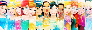
Yes, THESE designs.
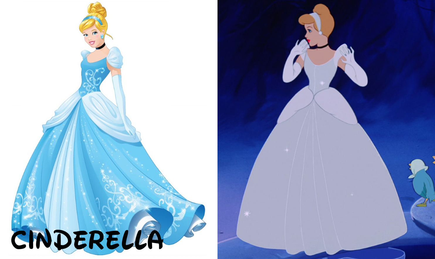
11. Cinderella
Now if I remember right, 灰姑娘 is slightly infamous for her new merchandise design. And if that is right, then I definitely see why. I find hers to least resemble the original character. I mean, sure, the key components are there. The general 设计 of her dress is the same, and her general hairstyle is the same. But good gosh, the coloring is excessive! The color of Cinderella's ballgown has been debated. Is it blue, 或者 is it platinum? Well, when she makes it to the palace, her dress appears blue (supposedly due to the lighting). But it is not as saturated as it is in her new design. 你 may also notice that her sleeves and 短裙, 裙子 floofs are 更多 flouncy and translucent. It's not a major change, but it's certainly noticeable. There are some earrings too which weren't there before. And if 你 don't know already, practically every princess' dress has additional embroidery.
As if the 袍, 礼服 wasn't bad enough, the face and cosmetics are wrong, too. While it might make sense to give 灰姑娘 a bun that appears 更多 physically possible (I'd even argue that it looks nice), it's too much of a departure from her signature updo. Her hair is also a different color. Originally she had "burnt orange" hair, then unofficially became a 草莓 blonde after the DVD restoration. But in merchandise, she is and always has been a straight-up blonde like her pal Aurora. Which is worse, the botched coloring 或者 the facial features? It's hard to say. It is difficult to tell that's the face of Cinderella, though. I think the main issue is the eyes; the shape is incorrect. The old lineup 设计 was closer, and the eyes was a big reason why. 你 can probably pick out 灰姑娘 from the lineup in context, but it's difficult to find discrete similarities to her original character model.
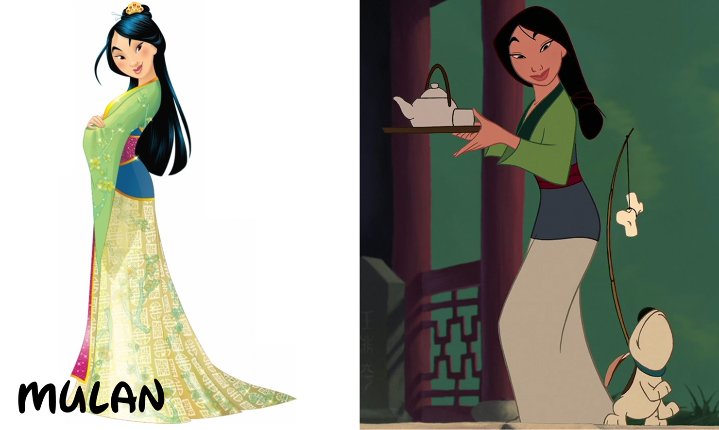
10. Mulan
Look Disney; it's bad enough that 你 give 花木兰 the cold-shoulder in merchandise. But now she must put up with this new design, too. Yikes. Well, the main complaint I have is with the face. Is this just something that's really difficult to do? Despite the similarity of these two images, 你 can tell that the face on the left just doesn't match. It's hard to say why, but I think they made it too scrunched up. As a result, her smile looks super odd. The eyes are okay, but the eyebrows make them seem worse because they're so arched and jetting off at different angles.
The hair is not bad. She has loose strands now, but that seems to be a trend with these designs. I placed 花木兰 above 灰姑娘 because even though the facial structure is off, the outfit is not as botched. The coloring is mostly the same; they only changed the 短裙, 裙子 color from ecru to pale yellow, and they added some designs. And the red 包, 换行 around her waist has been increased in length to where it almost touches the floor. And is that the comb from the movie in Mulan's hair? Well, it's not the right color, but I guess it's a nice coincidence. Mulan's 设计 is definitely not great, but is slightly 更多 tolerable than Cinderella's. Slightly.
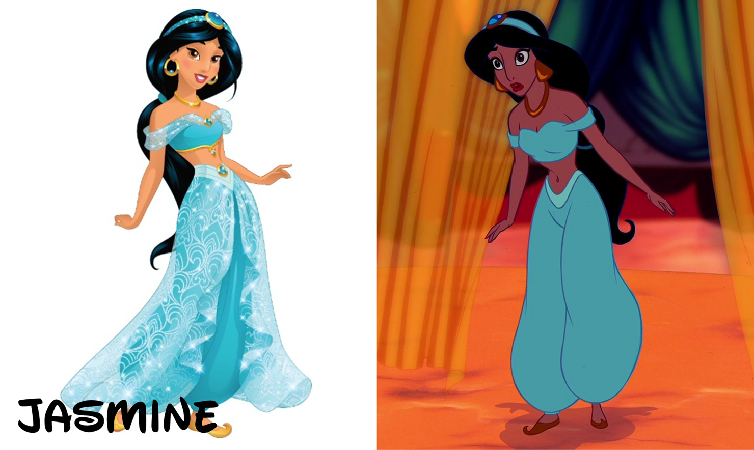
9. Jasmine
Maybe you're surprised to see her this low. And granted, her getup is pretty similar to what's in the movie. Her outfit is still teal, and her shoes, hairband and 项链 are the same. The major wardrobe changes are 1) changing the color of her jewelry and shoes to yellow, 2) the shape of the earrings, 3) the jewels, and 4) THE SKIRT!...pant, cover thing. It's Disney's delayed response to the fact that 茉莉, 茉莉花 doesn't sport a traditional dress. It looks kind of silly, but it doesn't take away from the 设计 drastically. And 你 may catch the new sleeves that she has, which replace the old ones to match the 短裙, 裙子 thing.
But again, the biggest issue is the face. I think 茉莉, 茉莉花 looks too young in the merchandise picture. She is curiously only 15 in the movie, so maybe they were trying to make her better match her age, although I doubt that's the reason. The eyes are again a major problem. They're too light, and the iris takes up too much of that space. Her hair was also modified, and not too badly, although it looks like it has less volume now. I'm surprised that despite all these changes, 茉莉, 茉莉花 still looks...sort of close to the original character. But the issues made here are still too great to rank higher.
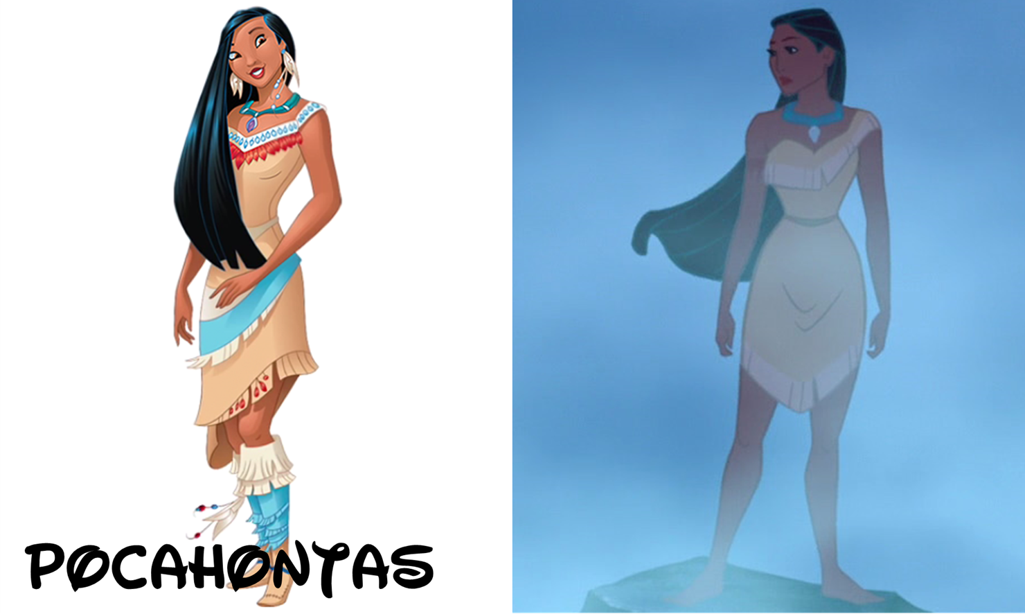
8. Pocahontas
Aaand maybe you're surprised to see that Pocahontas made it this far! It's true, they added a lot of clutter to her appearance. It's kind of ridiculous. They ornamented her with beads and feathers that were not there before, possibly to make it very clear that she's Native American. They've added these to her dress too, and it actually doesn't look too bad. That is to say, not only does the new dress look nice, but it also isn't super different from the original.
The boots from the 设计 just before this have stayed, much to our dismay. They don't look bad, but that's not really the point. Pocahontas is pretty well known for going barefoot throughout the entire movie, so seeing her with big and obvious 鞋类 is kind of a slap to the face. And of all the complaints I've made about princess' faces, this one takes the cake. She looks so dopey here that I can't explain it. Well, maybe I can. For one thing, her right eye (her right, your left) -- the iris looks like it's about to fall out the corner. Second, the other one looks like she's staring into your soul. And finally, she's smiling. Now I find this point interesting. Pocahontas doesn't smile a whole lot during her movie, especially with her teeth. And in 前一个 merchandise designs, she sported her signature smile-less stance. Now Disney's all in for the grins. So, why did Pocahontas make it to #8? Well, despite the obvious problems, I think she genuinely looks closer to the original character than the 前一个 entries. The added accessories are annoying, but they're not really replacing anything. And as goofy as her expression is, I think her eyes and hair are pretty close to what's in the film. They're both the correct shape! So congrats, Pocahontas, for not being dead last.
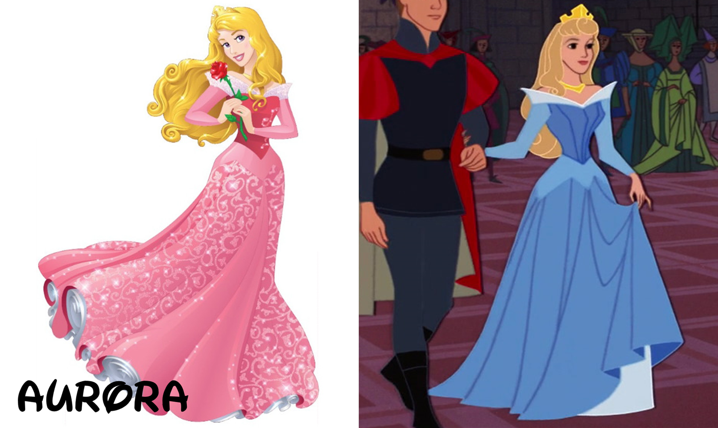
7. Aurora
Aurora's lineup 设计 has never been quite right. Despite her movie being pretty recognizable, her looks in that film seem to have escaped Disney's mind. So would 你 believe it if I 说 that I think this redesign is actually kind of an improvement?
Let's look at the dress. Considering the changes they've made to the other dresses, I'm surprised this one looks so close. They "only" added embroidery and sparkles to the skirt, and possibly the trim, too; I can't tell. And would 你 look at that! Her hair matches close enough, too. The color has always been super blonde in merchandise, even though in the movie, it's a light blonde. But the curls at the ends are correct. And her face is the part that I think has improved a little. Now the screencap I chose is not the best to reference (I chose it so as to compare the outfits), but if 你 were to look at a shot of her in the forest, like here...
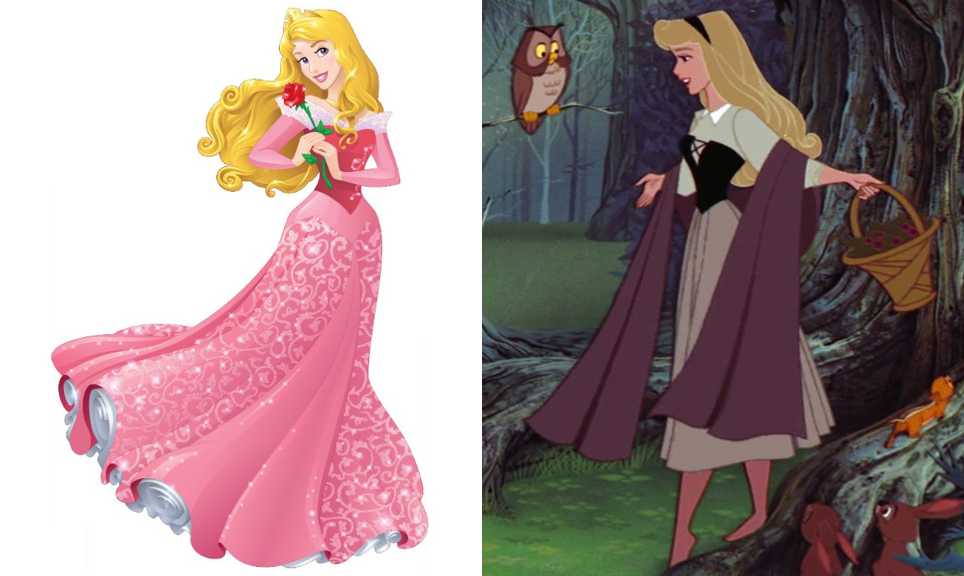
...then 你 might see 更多 of a connection. Her eyes are better shaped than before, although there's still a little work to do there. And they sure didn't forget the 紫色, 紫罗兰色 color! Seriously, among all of Aurora's physical traits, the eye color is what they got? It's not even consistent in the movie! But I digress. Her 总体, 整体 facial structure matches better than it did before, and even the smile looks alright. Now if they could perfect the eye shape, Aurora will be in business.
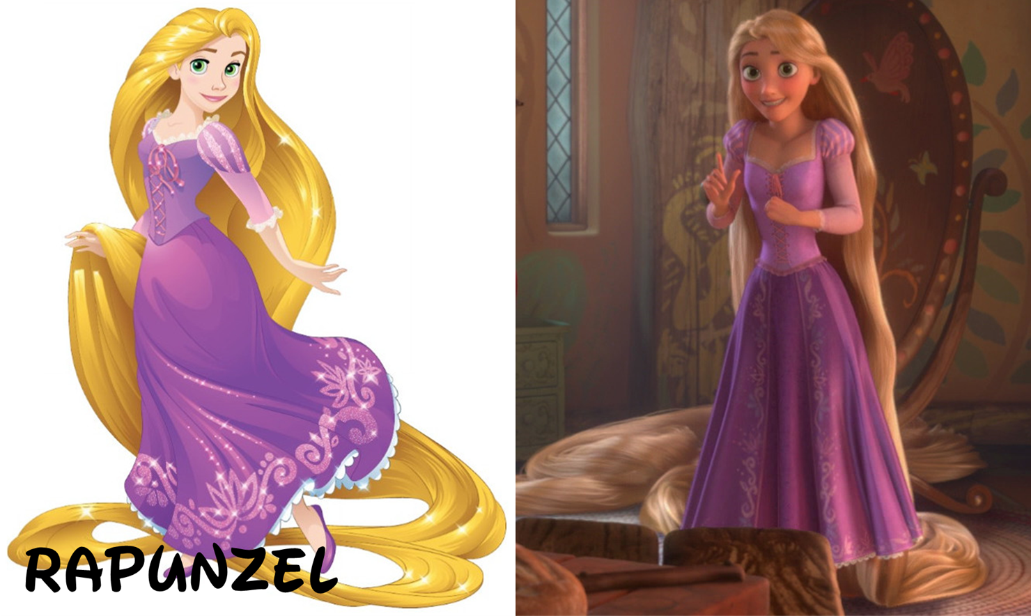
6. Rapunzel
Considering that Rapunzel had to be converted to 2D for her merchandise shot, she doesn't look half bad. The dress is pretty true to what's in the movie, although the floral pattern is along the bottom of the dress instead of vertically up the skirt. The shade of purple is slightly off too, but that's a nitpick. The only change that might be infuriating is giving Rapunzel some shoes. But in her defense, she probably needs them anyway. Joking aside, they were smart to keep the shoes simple, supplying her with matching 公寓, 单位 and not gaudy 鞋类 like Pocahontas.
Now her hair could use some work. It's not a realistic blonde color like in the movie, but instead very yellow like the other princesses. I'm going to give it credit, though; this might just be a detail that is 迷失 during the translation to 2D. The shape of her hair and the way it is arranged is also pretty good when 你 compare it to the film. 你 wanna take a guess what the problem area is? That's right -- the face! It's not that bad compared to the 前一个 entries, but again, detail is lost. Rapunzel is not quite as pale as is portrayed here, and I think they're missing the sort of baby cheeks that she has. But considering where Rapunzel is coming from, her lineup picture could have been much worse. She only suffers from some reduced detail, and understandably so.

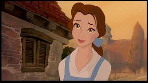
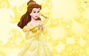
5. Belle
你 would not believe how difficult it was to find a good screencap of Belle for this. After searching for a couple hours, this closed-eye shot was the best I could get.
From here on out, the princesses' lineup designs will match their original characters fairly well. And Belle for the most part is pretty recognizable. The dress has not been altered too much. It looks like they might have added the same kind of 短裙, 裙子 poofs that Cinderella's 袍, 礼服 has, since the 最佳, 返回页首 part of Belle's 短裙, 裙子 is solid yellow like the torso. But they kept the sashes, and chose a fitting embroidery pattern of roses. The gloves look the same too, although they might have been made longer. It's worth noting though that her dress is 更多 of a straight-up yellow than in the movie, where it had a little 金牌 tinge.
As for the face (why is this so difficult to get right?!), it's not as bad as some of the others. Her eyes look nice and are correctly colored, and if I'm not mistaken, they do look almond-shaped. The mouth is not quite accurate, though. Her lips look rather thin. But the hair, though too light and much wavier, is recognizable enough. Her redesign could use some work, but it's pretty good nonetheless.

4. Ariel
It almost feels criminal to place Ariel this high, because there is one glaring issue with her 设计 -- the dress! It does not appear in the movie, although anyone who's seen it can tell that this merchandise dress was entirely inspired 由 her mermaid attire. The green and purple match perfectly, and I suspect that this new dress was made solely to make the character 更多 recognizable. When 你 think of Ariel, you're 更多 likely to remember her mermaid tail than any of the dresses she sports. But truly, this 设计 boasts excellent attention to the face. It matches REALLY well! Thankfully, Ariel has a very youthful appearance in the movie, so they didn't have to age her down (as they seem to have done with those other princesses' designs). The eyes are the correct shape and color, and the smile is alright. She's capable of much bigger, warmer smiles, but this one is almost there. And her wavier hair isn't such a big deal since everything else is so recognizable. Even with its changes, this portrayal excels at making Ariel still feel like Ariel.

3. Tiana
This 设计 annoys me because one aspect is done to a tee while the other is distractingly wrong. But praise needs to be 给 to Tiana's dress here. It looks like it wasn't tampered with at all! Perhaps the green part of the dress is too saturated, but if that's the biggest problem with it, I'd say they did something right here. The beads of her jewelry are blue, even though they look closer to silver in the screenshot, but it's a minor change. The eyes though are a major problem. Just as they did with Jasmine, they made Tiana look significantly younger. She looks like she's in her teen years...which technically she is (supposedly she's 19), but 你 know, her lower teens, like 14 或者 15. It's all in the eyes. The pupils again take up too much space, and the shape is wrong too. But gosh, if that dress isn't perfect. And also seeing as how the eyes are the only problem I have here, Tiana makes it to the 最佳, 返回页首 3.
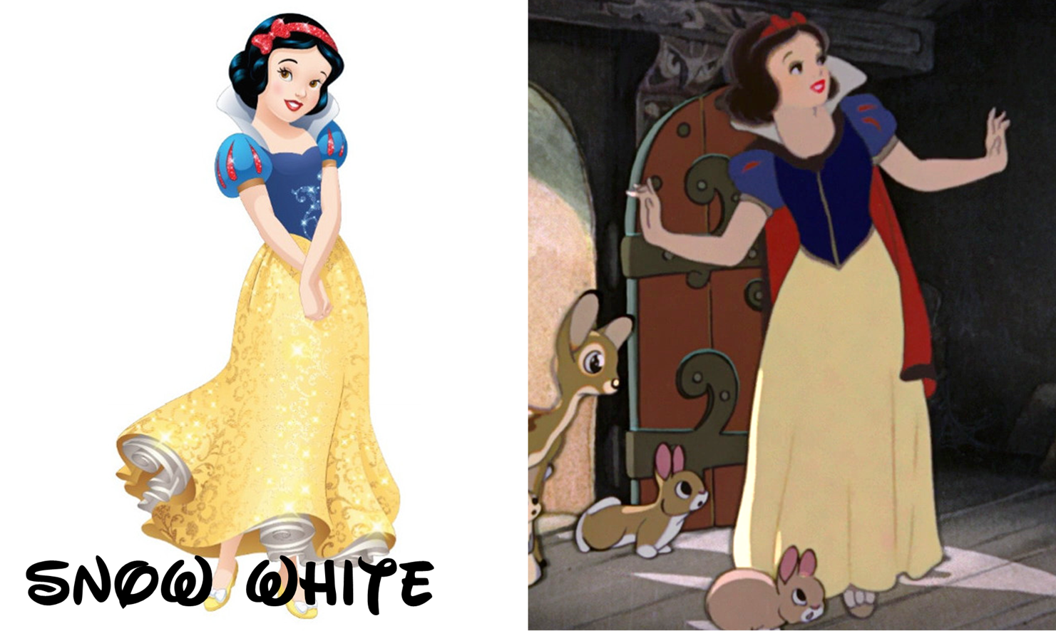
2. Snow White
Who would have thought that Snow White would get so lucky with her merchandise picture? Her 前一个 designs have always been...serviceable. The one thing that's bothered me is the smile. Sometimes, the smile is big, but doesn't feel warm. Other times, it's like this one -- a light smile that feels like she's smiling for a photo. In the movie, it's always warm and genuine. Just look at the screencap! This one feature is just something that 迪士尼 hasn't been able to get right.
That being said, virtually everything else gels up. The dress has only experienced minor recoloring and, of course, sparkle addition (which looks pretty tacky, but whatever). The shoes, the collar, and the headband are accurate, though. If 你 really want to nitpick, 你 could mention that the bow wasn't off to the side like that before, but I could care less. I 爱情 that the face is as accurate as it is. Again, the look isn't movie-quality, but the details are pretty close. They correctly portray her small eyes, red lips, and light skin tone. It's about as good as one of these things can get.
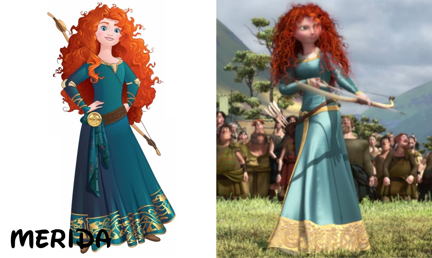
1. Merida
Now this one is a shocker. 或者 is it? If 你 recall, there was a little controversy over Merida's original lineup design. This character, known for not exactly looking like a conventional 迪士尼 princess, looked like she had just spent the 日 getting a makeover at the Bibbidi Bobbidi Boutique:
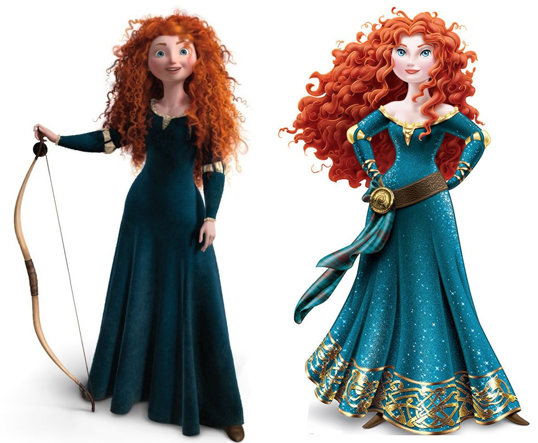
After that little slip-up on Disney's part, they of course had to come up with something a little closer to what's in the movie. I think they were afraid of messing up again, so they took extra care into getting everything about Merida's appearance right -- 或者 at least, not over-feminizing it. Now someone, correct me if I'm wrong, but it looks to me that this dark-colored merchandise dress is a combination of the initial dark dress (second image, left) and the light blue one (first image, right). It's basically the dark dress with some extra, NOT over-the-top details. That bottom 金牌 pattern is nice and compliments the other 金牌 parts. No sparkles, no glitter, no off-shoulder sleeves -- it's everything 你 could want. And that's not even considering the face, which couldn't be 更多 perfect. The round blue eyes are spot-on, as is the face shape and the red locks. What a turnaround for Merida, beginning with one of the most inexcusable designs ever in the lineup to (in my opinion) the most accurate of all.
That's the end of this article! Thank 你 for reading, and let me know which designs 你 think are the most and least accurate. See 你 guys around!

Credit to rzenteno for this wonderful image!


So yesterday I wrote an 文章 about the Scariest Moments In Each DP Movie IMO, today I'm going to write about the 最佳, 返回页首 10 Scariest DP Movie Moments IMO, I'm also going to write an 文章 about the Scariest DP Movies. You'll probably recognise some moments from my 前一个 articles, but there'll be new ones too so I hope you'll enjoy this article
10. Mordú
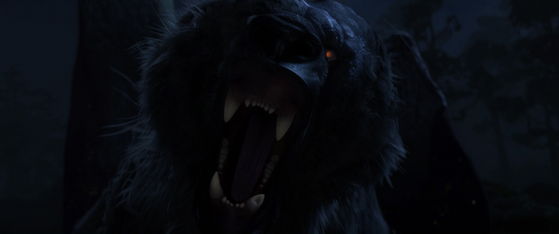
I'll just copy what I 说 in my 前一个 article: This 熊 is really scary looking imo especially with all of those arrows on him and the eyes are creepy too and his dark look also helps making him 更多 scary. Now his death isn't...
continue reading...
10. Mordú
I'll just copy what I 说 in my 前一个 article: This 熊 is really scary looking imo especially with all of those arrows on him and the eyes are creepy too and his dark look also helps making him 更多 scary. Now his death isn't...
Unlike my 最喜爱的 迪士尼 Princess 列表 this 列表 hasn't changed so much, but I still felt like 写作 an 文章 about this because not only has it changed, it's also been a while since the last time I wrote this article. I find all the princesses pretty, but I have prefrences, for example I prefer the 更多 realistic looking princesses so don't be surprised if most of the bottom placements are the cartoony looking princesses. Anyway enjoy this article
13. Jasmine

I've never really found 茉莉, 茉莉花 beautiful, she's pretty though. If I where to base this on color scheme only she would be much...
continue reading...
13. Jasmine
I've never really found 茉莉, 茉莉花 beautiful, she's pretty though. If I where to base this on color scheme only she would be much...
Last time I wrote this 列表 《勇敢传说》 and 《冰雪奇缘》 hadn't been released so now I'll write this 列表 with them included, hope you'll like it
12. Pocahontas
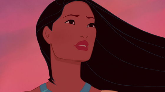
This scene is amazing to look at, no wonder many people loves this ending, but why is it then last on my list? While it's an amazing scene to look at it isn't a happy ending, normally I don't mind it, but 迪士尼 is known for making happy endings so honestly if this movie was made 由 another company and was live action I probably would 爱情 the ending more
11. Mulan

This ending starts off great with 花木兰 reuniting with her father and Shang...
continue reading...
12. Pocahontas
This scene is amazing to look at, no wonder many people loves this ending, but why is it then last on my list? While it's an amazing scene to look at it isn't a happy ending, normally I don't mind it, but 迪士尼 is known for making happy endings so honestly if this movie was made 由 another company and was live action I probably would 爱情 the ending more
11. Mulan
This ending starts off great with 花木兰 reuniting with her father and Shang...


What if all of the 迪士尼 Princesses were American and lived in American cities? Which ones would they choose to live in? (*Note, I comprised this 列表 of where they would want to live as a free choosing adult, not where they would have been born and raised. That is another list.)
Snow White: Phoenix, Arizona
Because there is a large elderly population there so Snow could help them like she did the dwarves. She is also a conservative princess that I think would enjoy living out under the stars in a 更多 traditional place.

Cinderella: Minneapolis-St.Paul, Minnesota
Because it is a city rich...
continue reading...
Snow White: Phoenix, Arizona
Because there is a large elderly population there so Snow could help them like she did the dwarves. She is also a conservative princess that I think would enjoy living out under the stars in a 更多 traditional place.
Cinderella: Minneapolis-St.Paul, Minnesota
Because it is a city rich...
What if all of the 迪士尼 Princesses were from American cities? Which ones would they be from? (*Note, I comprised this 列表 of where they would be born and raised from not where they would be most suited as a free choosing adult. That is another list.)
Snow White: Portland, Oregon
Because it has a very friendly and comfortable environment. Snow was very naïve and very trusting, it would make sense if she grew up in a 安全 place like this.

Cinderella: Dallas, Texas
Because it is very conservative and traditional. There are 更多 gender roles so it would make 更多 sense why 灰姑娘 took...
continue reading...
Snow White: Portland, Oregon
Because it has a very friendly and comfortable environment. Snow was very naïve and very trusting, it would make sense if she grew up in a 安全 place like this.
Cinderella: Dallas, Texas
Because it is very conservative and traditional. There are 更多 gender roles so it would make 更多 sense why 灰姑娘 took...
(DISCLAIMER:I don't hate any princess, I have my least 收藏夹 but still..)
13. Elsa
Although I 爱情 ALL 迪士尼 Princesses I find Elsa to be extremely annoying and overrated. But I can't say that to anyone without them griping at me! Originally Elsa was at number 9 或者 ten on this 列表 but the 粉丝 dropped her down even more. So why else besides 粉丝 do I put her here? She can't take responsibility for her actions! She never stood up to anyone and blamed the whole thing on Anna, when it was partially her fault. Elsa should have told Anna at the coronation about her powers, it's not like...
continue reading...
13. Elsa
Although I 爱情 ALL 迪士尼 Princesses I find Elsa to be extremely annoying and overrated. But I can't say that to anyone without them griping at me! Originally Elsa was at number 9 或者 ten on this 列表 but the 粉丝 dropped her down even more. So why else besides 粉丝 do I put her here? She can't take responsibility for her actions! She never stood up to anyone and blamed the whole thing on Anna, when it was partially her fault. Elsa should have told Anna at the coronation about her powers, it's not like...