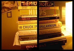

A note to book-cover publishers: before 你 decide on a cover, go into a bookstore and head to the respective section. See the trend of tints and shades that color that genre. then pick a different color! It is astonishing that, even in this 日 and age, history 图书 about China and Russia are still primarily red, 图书 about Ireland are green, and "women's books"(i.e. Chick Lit and Self Help) are pastel pink, blue 或者 yellow. Honestly, even murder mystery books, when targeted towards female readers, take on 粉, 粉色 as opposed to the red and/or black of other mysteries.
The psychology of book covers seems not to have evolved past an assumed color code. And yet, as a bookseller, I wonder why a book publisher doesn't try to break the conformity so to make the book stand out. Got a new history book about China? Try bright yellow. It's still in the warm 颜色 but will pop! Irish books? Try a 橙子, 橙色 (tho' that might fall into a political realm of Catholic Green vs. Protestant Orange....so maybe a yellow would too work in this scenario).
And yet we are taught to not "judge a book 由 its cover". But how can we not? We have been so trained to. I bet 你 can imagine how well a hard-boiled noir would fair with a pastel blue cover....not well at all.
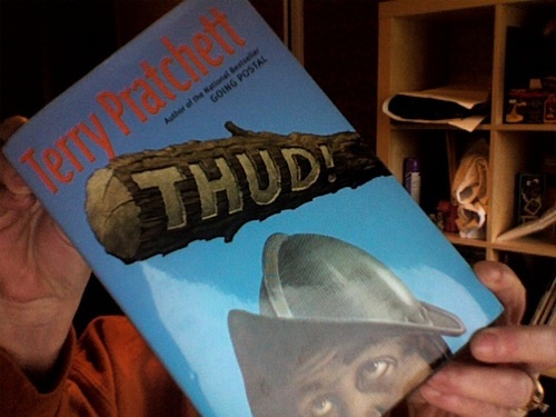
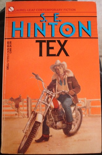
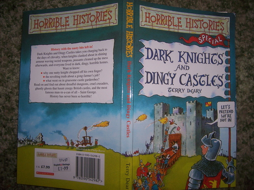
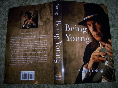
That's not all. Make sure your book cover is legible. Take this example. 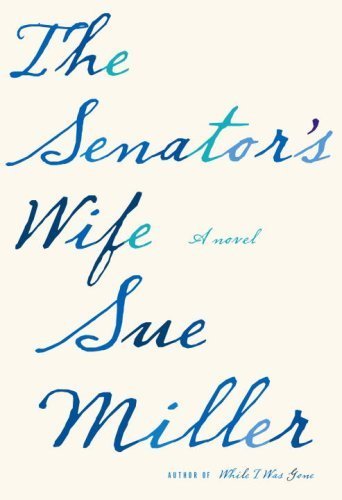
This is a bad book cover. It's illegible from only six feet away and the eye quickly glazes over while looking at the cover, making it difficult to find it for wanting customers. Making the 标题 and the author's name the same size font also confuses the eye. Maybe it is a good book. But the cover annoys me. Ugh.
Admittedly, I do not participate in the creation of book covers. I do not know whether there are particular rules 或者 regulation in the formation of genre-specific covers. All of this is coming from a simple bookseller who has to find dozens of books, quickly, all day. But I do think the book world would fair well if the creators did occasionally stop in a store and see how certain colors, fonts, and pictures work against and with each other. And yes, there are wonderful book covers out there. Too many to actually share with all of you. But beware of the bad ones.
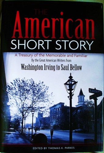
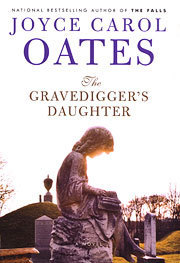
I will end this 文章 with a simple, fun comparison of how "great" minds can often think alike. Here is a collection of very different 图书 can feature eeriely-identical covers. Sometimes I will pick up one in the bookstore, thinking it is the other. Also, link has an amazing laid-out analysis of other similar book covers. So does this link.
Anyway, enjoy.


The psychology of book covers seems not to have evolved past an assumed color code. And yet, as a bookseller, I wonder why a book publisher doesn't try to break the conformity so to make the book stand out. Got a new history book about China? Try bright yellow. It's still in the warm 颜色 but will pop! Irish books? Try a 橙子, 橙色 (tho' that might fall into a political realm of Catholic Green vs. Protestant Orange....so maybe a yellow would too work in this scenario).
And yet we are taught to not "judge a book 由 its cover". But how can we not? We have been so trained to. I bet 你 can imagine how well a hard-boiled noir would fair with a pastel blue cover....not well at all.
That's not all. Make sure your book cover is legible. Take this example.

This is a bad book cover. It's illegible from only six feet away and the eye quickly glazes over while looking at the cover, making it difficult to find it for wanting customers. Making the 标题 and the author's name the same size font also confuses the eye. Maybe it is a good book. But the cover annoys me. Ugh.
Admittedly, I do not participate in the creation of book covers. I do not know whether there are particular rules 或者 regulation in the formation of genre-specific covers. All of this is coming from a simple bookseller who has to find dozens of books, quickly, all day. But I do think the book world would fair well if the creators did occasionally stop in a store and see how certain colors, fonts, and pictures work against and with each other. And yes, there are wonderful book covers out there. Too many to actually share with all of you. But beware of the bad ones.
I will end this 文章 with a simple, fun comparison of how "great" minds can often think alike. Here is a collection of very different 图书 can feature eeriely-identical covers. Sometimes I will pick up one in the bookstore, thinking it is the other. Also, link has an amazing laid-out analysis of other similar book covers. So does this link.
Anyway, enjoy.

C.S. Lewis vs. Stephanie Meyer


Naum Kazhdan/The New York Times